Click on the picture to see a larger version.
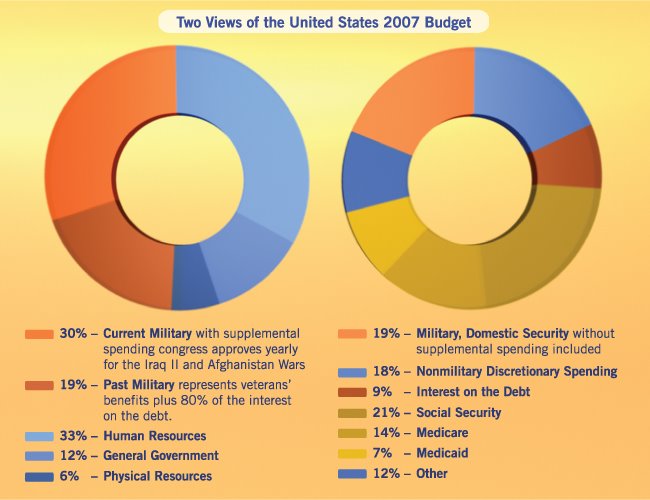
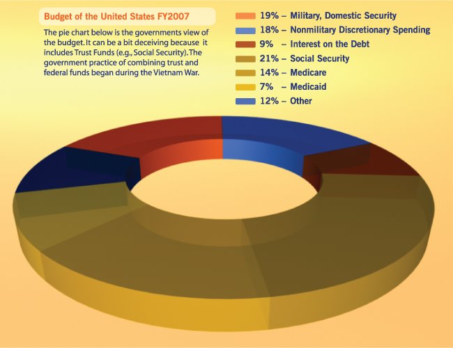
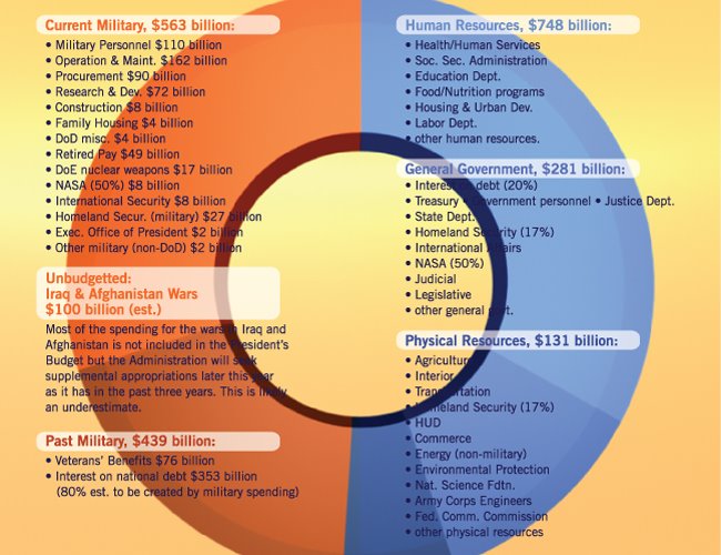
There are two orange sections shown in these pie charts. The second orange section, the darker burnt orange/brown, mostly shows the debt payment that goes towards military expenditures. Some of it goes towards veteran pensions and veteran support which has been cut since Bush has taken office. There is an argument about how much of our debt payment actually goes towards the military. It could range from 40% to 80%. Since George Bush has gotten both things he wanted most, large tax cuts for the rich and his war in Iraq, this pie chart shows 80% of our debt payment going towards the military.
2 comments:
So I assume that "education" is part of the "other" part of the pie?!?!
do you, by any chance, have comparative pie charts for say... India or China? GB or Germany?
I ask because in relation to those other countries... the first two (India and China) seem to be "the future" while the second two (GB and Germany) in a way, are the past.... but then Germany seems to have adapted and created a forward thinking socialized nation.
I don't have charts for the other countries.
I think the biggest reason to include these charts in this blog is to show how much of the U.S. tax dollar goes towards American Hard Power. It's staggering.
Right now I'm working on the 'American Soft Power' entry which gives alternatives to spending so heavily on the military.
Plus, I recomend watching the documentary 'Why We Fight' to see why we spend so much on the military.
Thanks for all the comments MK!
Post a Comment